This is not as uncommon as you may think. My general rule is to do what my clients want; however, there may be a reasonable solution.
For the Client
Your designer needs to understand what it is that makes you not want color…whether you have “been there, done that,” or if it reminds you of your parents’ lifestyle and is not your style at all. You may hate bright colors, but would like muted softer tones, or you may hate pastels and only want earth tones…this needs to be conveyed to your designer from the very beginning. However, if you are in a rut and you have asked your designer not to allow you to make the same mistakes you have always made, then it’s time to trust your designer and allow him or her to fulfill your innermost desires with color.
If you hired your designer, there must have been a reason…so let them understand your issues with color and ask them to give you examples of various forms of color intensity as well as something with little or no color — just a lot of contrasts in textures, finishes and a lot of excitement to replace what colors do for a room.
Usually those who do not like color have never found the right color so you think beige is easy…not true. When you go for a very subtle tone on tone effect, the dyelots are much more important and then the hues of those colors create harmony or chaos. A one-color décor has no depth or contrast, so at least provide your designer with something they can work with. While the old adage “the client is always right” is true, you can cause your own project to fall flat without allowing the designer to broaden your horizons with subtlety and contrast and the proper balance.
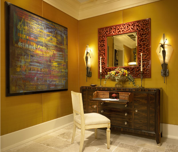
Recently we completed a project for a client who wanted soft blue and yellow. We did not give him soft blue or yellow…he already had that in his old home and in his country home. I told him to allow me to do a color palette which would show off his large art collection, so we created a very light interior with a lot of rich golds, bronzes, some rosewoods and Macassar ebonies with accents of ivory and subtle tones of earthy reds, oranges and plum tones in some of the rugs. The overall effect is a neutral color palette of mixed earth tones with his many colorful oil paintings from various 19th and 20th Century periods being the focal point. We did, however, give him a subtle grey-blue and ivory theme in his bedroom with rosewood finishes, a touch of silver leaf and a little charcoal brown to balance out the room to feature his ivory shagreen bed. All over this is a blend of Art Deco, Biedermeier, Contemporary and Mid-Century Modern furnishings in a gallery like setting.
For the Designer
As the designer, you may like color, but you also need to expand your horizons and do something rich and lush without the use of color. Varying the textiles to create a wide variety of textures is imperative when only using one color…leathers, lightweight and heavyweight wovens, patterns on linen and tapestries, cut velvets, gloss and matte finishes, glass, stone, woods…all can be quite exciting if you create enough drama and contrast in your textiles to create a well balanced interior. Some clients equate color with some preconceived notion that reminds them of something they don’t want to be identified with. Often clients don’t remember they have a lot of color in their artwork or in pieces they want to use, so explain to them about color, that it can be intense, bold, soft or delicate and more of a nuance than an actual impact element. Also, give your client options so they can see your point of view, but never force them to have color…it can backfire and if they rebel, you may never get them to trust you again. Remember, color is personal and you don’t live there…you only reside there while you are working and you get to go home to your preferences, so let them have theirs, but don’t forget to shake things up for them so they realize how wonderful a home they have due to your abilities…even if it is a bit colorless for you. We were recently hired to spice up a home a new client bought from one of our older clients…they don’t like how soft the original colors were, so we are bringing in colorful antique Oriental rugs and a few wallcoverings so they don’t have to repaint the entire house since they love much of the house as is, but they can now make it their own by adding some rich colors. Remember there is not ugly color…just bad color matches.